


The worldwide artist network known as Bluecanvas has just released an exclusive interview that I did with them.
(Video Link) The interview explores how Dinotopia came into being and the relationship between art, science, and imagination. Interview by Shana Nys Dambrot.
----
Visit the Bluecanvas website
Subscribe to the Bluecanvas magazine
Dinotopia: The World Beneath
Dinotopia exhibition at the Lyman Allyn Art Museum.
To read the complete interview, and to see the full range of images, you'll have to pick up Issue 14 of Bluecanvas magazine, which will be available in late November.
Friday, August 31, 2012
Cast Shadows and Form
One way to define the contour of a landscape is by means of cast shadows. In late afternoon, the shadows from trees or utility poles wrap over hills, jump up walls, and drop down over curbs.

Creating bands of light and dark adds a great deal of depth to a landscape, and it gives you something to place light or dark figures against.
Thursday, August 30, 2012
Mucha in Iowa

Alphonse Mucha: Inspirations of Art Nouveau at the National Czech & Slovak Museum & Library in Cedar Rapids, Iowa. She said it was worth the six hour drive from St. Paul, Minnesota.
She says, "I hadn't realized how large a format his litho prints were, and that--of course--reproductions of his work don't begin to accurately convey his palette! The man apparently frequently used metallic inks that are brilliant in person but turn flat and dull when reprinted. They also feature dozens of his family and model photographs pulled from glass negatives. Given the limitations of photography compared to today's, he was just as talented a photographer as he was a painter!"
The show is up until the end of December.
Thanks, Amber.
Wednesday, August 29, 2012
Falter's tracing pad

It's natural to assume that Falter found this idea readymade somewhere, but he had to construct it first in his imagination using a tracing pad.

Here is how another idea looked at sketch stage. A group of planners hold up a drawing for a highway cutting through a hill. Surveyors drive in stakes in the background. The old farmhouse is in the way.
The figures are drawn very simply, with very little detail. Falter is not hiring models yet.

He places another page of tracing paper over the first sketch. Falter changes his mind and explores another concept. He's still working from his imagination. The old house changes to a one-room school. The planners hold up a drawing of a new district school.

For the final cover, he returns to his original concept of the new highway threatening the house.
The final painting is not as successful as "Snowy Ambush." Perhaps the problem is that the characters aren't developed, so it's hard to tell how Falter feels about the situation. Also, he accurately shows the engineers using a blueprint, but blueprints don't read quickly enough to make immediate sense on a cover.
All these problems need to be solved at the tracing pad stage. It's worth spending tireless effort on the early sketch stages, because no amount of rendering will fix a problem that lurks on the tracing pad.
-----

Addendum: I posed the question:
"I was wondering how Rockwell would have approached this whole situation. I imagine he would have focused on the plight of the property owner whose place has been condemned by eminent domain. That could have been done with poignant humor and sympathy."
....and Matthew Mattin suggested this example, which I had forgotten about. Thanks, Matthew!
Wikipedia on John Philip Falter
Wikipedia on John Philip Falter
Tuesday, August 28, 2012
Markers for Underdrawing?
Oscar asked: I've been playing with the technique of an early cartoon layer to start an oil painting, and, since drawing's my druthers, I've been trying out Sharpies and similar pens as a replacement for ink/thin black paint. Do you have any tips for this? Are markers likely to cause trouble in terms of paint reaction, color fastness, etc?
Oscar, Yes, beware of markers for underdrawing. You are safest with pencil, charcoal, or India ink. Once a long time ago, I used a black Sharpie marker for a preliminary drawing under an oil painting but I discontinued that idea because the dye had a nasty habit of bleeding through to upper layers. Covering the drawing with clear-coat layers doesn’t necessarily cure the problem of dye migration.

Markers are also prone to fading and color shifting. This is often a problem with drawings done entirely in markers. If you use different brands in the same drawing, they often shift in different ways. I did this marker drawing of a horse drawn milk wagon in 1981 but luckily it hasn’t faded too much because it was kept in the dark. Cool, dark storage slows down these processes, which happen at a molecular level.
Markers vary a lot in their dye and vehicle formulations — some are pretty stable— so the best thing to do is try out all kinds materials and procedures on scraps and put them in a hot, south window to test how they fare over time.
Monday, August 27, 2012
Dip pens and Dinotopia
Dinotopia: The World Beneath has just been rereleased in a new expanded edition from Calla Editions, an imprint of Dover Publications.


LINKS
(Video link) This video describes how I decided to re-letter the captions by hand to make them look more authentic. (Note—I got the Lego camera dolly working better!)
The story follows Arthur Denison as he leads an expedition deep into the mysterious caverns beneath the island of Dinotopia, where he discovers clues about ancient civilizations and hidden treasures.

Meanwhile his son Will continues his training as a pilot on a giant pterosaur known as a skybax. The story itself is 160 pages, fully illustrated in color.
The publisher made all new digital scans, and the colors are now truer to the original art than ever before. The quality of the paper and binding is incredible, and I have no idea how the publisher produced the book for the same price that the original book sold for back in 1995.

In the back section of the book is an archive of behind-the-scenes sketches, storyboards, photos, and maquettes to show exactly how the book was conceived and created.
We just received our shipment here at the Dinotopia Store, so you can order a signed copy today. If you follow this link, we can handle orders from the USA (shipping only $4.50), or from anywhere worldwide ($35 for shipping).
LINKS
Order a copy of Dinotopia: The World Beneath signed by the author.
Find the book at your local bookseller or at Dover.
Find the book at your local bookseller or at Dover.
Check out my other videos or subscribe to the GurneyJourney YouTube channel so you can see new videos before anyone else.
Sunday, August 26, 2012
Mark Crilley's Realism Challenge
(Video link) Mark Crilley tears up a playing card and then creates a matching trompe l'œil in time lapse.
----
Crilley also does a lot of how-to Manga videos,
From Best of YouTube
Saturday, August 25, 2012
Focus on Nature exhibition
Yesterday in Albany, New York, we attended the artists' reception for the exhibition of natural science illustration called "Focus on Nature."

Many of the artists attending talked a little about their paintings. Beverley Irwin described how she was able to observe this specimen of Brush-tailed Rock-wallaby near her home in Toowoomba, Australia.

In addition to being an artist, Elayne Leighton has been a high school teacher and farmer. She noticed this relatively rare wasp-like fly (Physocephala tibialis) and rendered it with colored pencil and gouache on frosted mylar drafting film while observing it through a stereoscopic microscope.
"I'm like a little kid who never grew up," Elayne said. Encouraged by her aunt, Elayne did sketches of animals so that she could take them home and share them with others.


Milly Acharya of Ithaca, New York, painted this watercolor portrait of a garlic plant, with great attention to positive and negative shapes. What makes this painting different from a strictly aesthetic work of art is that it clearly displays the diagnostic features of the plant form, the qualities that botanists would be looking for.

Watercolor is the dominant medium in the exhibit, but just about everything else is represented, including oil, acrylic, graphite, colored pencil, and digital.
------
I have two paintings in the show, "Mud Trap" and "Elasmosaurus."
Focus on Nature will be on view at the New York State Museum through December 31st, 2012.
View the whole catalog as a PDF, with artist commentaries and contact info.
Friday, August 24, 2012
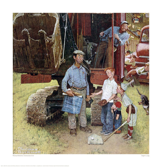
Dinotopia at the Lyman Allyn
Yesterday a truck picked up the artwork for the Dinotopia 20th anniversary exhibition coming up next month in Connecticut.

This exhibition of about 100 works will be by far the largest and most comprehensive showing of my original artwork. It will feature never-before exhibited works from all four Dinotopia books, including, for the first time, Dinotopia: First Flight.

The curators took a special interest in the creative process, with a detailed examination of preliminary sketches, hand-made maquettes, reference photos, and plein-air studies. Plus there will be a few non-Dinotopia landscape paintings, National Geographic illustrations, and science fiction works.
If you've already seen the Dinotopia exhibitions at the Norton, the Delaware, or the Norman Rockwell art museums, this show will feature a completely different set of work, most of which has never left the studio.
If you've already seen the Dinotopia exhibitions at the Norton, the Delaware, or the Norman Rockwell art museums, this show will feature a completely different set of work, most of which has never left the studio.
There will be a whole slate of special programs, including book creators Walter Wick and Bruce Degen, presentations on dinosaurs, and an American Girls Tea Party. I'll be doing a presentation and book signing on October 13.
"DINOTOPIA: Art, Science, and Imagination" will be at the Lyman Allyn Art Museum in New London, Connecticut from September 22, 2012 through February 2, 2013.
"DINOTOPIA: Art, Science, and Imagination" will be at the Lyman Allyn Art Museum in New London, Connecticut from September 22, 2012 through February 2, 2013.
Thursday, August 23, 2012
Ironclad Cutaway
We all need a breather after yesterday's post!

So here's a simple one. Smithsonian magazine has a new Fall newsstand issue devoted to the U.S. Civil War. It includes my cutaway paintings comparing the CSS Virginia (Merrimack) to the USS Monitor.
Wednesday, August 22, 2012
Artist Station Postcard

The design can be used only on one day and in one place, the hometown of the artist. When I designed the World of Dinosaurs stamps, they asked me if I wanted to do an Artist Station cancellation. Here is the hand-lettered and drawn pen and ink art that I created. The Postal Service scanned the art and made a rubber stamp out of it.

Here's how the actual cancellation looked on one of the stamps. The designers make a few slight changes, making the "W" smaller and moving the date to the top of the circle.

And here's a one-of-a-kind postcard with a scene from Dinotopia: The World Beneath.
I would like to give this special signed gift to a lucky blog reader from anywhere in the world.
Here's what you have to do to win it. Just be the first person to leave a comment on this blog post after 5:00 PM New York time today (Wednesday). The winner will be the one who leaves the first comment to be posted after 5:00 Eastern time (or 17:00 on the 24 hour clock). My computer is logged to Apple time. You may comment more than once.
ADDENDUM: Daniel of Florida was the winner. Congratulations, Daniel, and thanks everybody for entering.
---More about World of Dinosaurs
Tuesday, August 21, 2012
A. L. Garcia Fights the Crowds
Contemporary realist Antonio López Garcia (b. 1936) paints everything from direct observation. He works on large canvases, and he is a patient, careful observer.

When he wants to paint an urban scene, he sets up his canvas right on the street and deals with the wind, changing light and other distractions. Here's his painting Gran Via, with the cars and people typically deleted.
(Video link) This video shows him struggling to paint in a public square in Puerta del Sol. Surrounded by clueless tourists, cameras, traffic, and other distractions, he stays focused. It takes sheer determination to do this sort of work.

Note how his painting surface is nearly 90 degrees away from the view of the scene. And note the unusual device he uses for measuring slopes and lengths. He rests one end against his cheek to get a constant unit of size.
One thing that might have helped him with the curious crowds would be to set up stanchions or traffic cones. I try to bring my cones when I'm doing street painting, and they look official enough to keep people back. Uniforms help, too. It also works, if you can get away with it, to set up on a flatbed truck or the back of a pickup to get a little protection from the chaos.
----
Previously on GJ: Traffic Cones

When he wants to paint an urban scene, he sets up his canvas right on the street and deals with the wind, changing light and other distractions. Here's his painting Gran Via, with the cars and people typically deleted.

Note how his painting surface is nearly 90 degrees away from the view of the scene. And note the unusual device he uses for measuring slopes and lengths. He rests one end against his cheek to get a constant unit of size.
One thing that might have helped him with the curious crowds would be to set up stanchions or traffic cones. I try to bring my cones when I'm doing street painting, and they look official enough to keep people back. Uniforms help, too. It also works, if you can get away with it, to set up on a flatbed truck or the back of a pickup to get a little protection from the chaos.
----
Previously on GJ: Traffic Cones
Monday, August 20, 2012
Mythological Twist
In the 1700s, it was a common practice to give an academic figure study a mythological twist. For example, this 1756 painting by Nicolas-Guy Brenet isn't just any reclining figure. It's "Sleeping Endymion."

Endymion was a shepherd who had attracted the loving attention of the moon goddess Selene. She caused him to fall into an eternal sleep (with his eyes open) to preserve his beauty and youth. She would then be able to visit him every night.

Here's a similar pose but a different mythological setting. The painting, by Jean-Bernard Restout (1736-1796), is called either "Somnus," "Morpheus," or "Hypnos." Hypnos is the god of sleep or resides in a cave of eternal darkness. He is often shown with wings coming from his head, but here he looks more like an angel resting against his wings.
Adding these mythological layers can seem extraneous or gratuitous if the story doesn't guide the entire conception from the start. But when it's done thoughtfully, it offers both the artist and the viewer many new layers of feeling and association.
The problem for artists these days is that the audience is generally not familiar with the stories and the characters of the Greek and Roman mythology or of the Bible. An artist can count on everyone knowing what a cupid or a mermaid is, but viewers might not be as familiar with characters such as Sisyphus. Despite Hollywood's recent attempts to popularize mythic stories, the characters most people recognize tend to be comic book superheroes, which are trademarked and owned by big corporations.
-----
Here's another interpretation of Endymion
Wikipedia / Endymion
Wikipedia / Hypnos
Sunday, August 19, 2012
Posing for Will Denison of Dinotopia

----
From Dinotopia: Journey to Chandara, 2007.
Previously on GurneyJourney: New Use for Refrigerator Cartons
Saturday, August 18, 2012
Matte Artist Peter Ellenshaw
To create the film illusion of an imaginary landscape or city, nowadays moviemakers create 3D digital environments, generally by replacing the greenscreen behind the action with a layered virtual environment.
But in the early days of film, the art of matte painting was the province of oil painters with traditional skills. Their scenic paintings had to seamlessly match the photographed action, but they also had to convey the emotional spirit of the scene.
(Video Link) One of the most remarkable pioneers in this field was a British-born painter named Peter Ellenshaw (1913-2007). In this video, he tells his story: how he started painting scene extensions for Thief of Baghdad (1940) and how he got some dream jobs for Walt Disney on Treasure Island, Mary Poppins, Twenty Thousand Leagues Under the Sea, and Darby O'Gill and the Little People.
The hour-long video is broken into six chunks of 10 minutes each.
Part 2
Part 3
Part 4
Part 5
Part 6
Previously on GJ:
Digital Matte Painting
Blending into the Background
Book: The Digital Matte Painting Handbook
Friday, August 17, 2012
The Most Unappealing Color
Recently the Australian government announced its new rules for making cigarette packaging as unattractive as possible.

Instead of allowing distinctive corporate logos, the packages must use a generic type font called Lucida Sans. They must show photos of the diseases caused by smoking. And every package must be printed in Pantone 448C.
The government hired a research firm to come up with the most unappealing color possible. The company conducted studies with nearly 1000 people to find out what color suggests low quality and lack of appeal. The research firm then recommended a drab greenish-brown hue that is far away from the bold reds and blues that have been used traditionally in cigarette packaging.
Is Pantone 448C truly the most unappealing color? This brings us to a question artists continually face: Is there such a thing as a disgusting color, or is it all a matter of context? Are greenish-brown colors the kiss of death in painting?
I wondered if any great artists used this color successfully.


Thomas Dewing often used a greenish palette. In "Lady in White," there is no red. The background is slightly gradated. The dress is painted with pale blues and yellows, and the seat cushion tends toward yellow green.

Van Dyck's portrait of Horace Walpole uses large areas resembling Pantone 448C for the background and the book, with adjacent red-browns at close to the same value.
What do you think? Were any of them successful? What is your personal reaction to 448C? Please share your reaction in the poll at left and thoughts in the comments.
Addendum--Here are the poll results to the question: "What is your reaction to Pantone 448C?":
4% Disgusting,
20% Mild dislike,
7% No reaction,
18% I like it,
27% I love it,
39% It all depends.
Bloomberg report on new packaging and how it was decided upon.
Previously on GurneyJourney: The Mud Debate
Thursday, August 16, 2012
Jon Whitcomb and illustration styles
The cover feature of the new summer edition of Illustration Magazine is entitled "The Glamorous World of John Whitcomb.

Whitcomb (1906-1988) dominated the world of illustration with his portrayal of stylish women and movie stars. In addition to a very prolific output of editorial and advertising work, he played the electric organ, wrote a gossip column, and developed his own photographs.
He compared the making of an illustration to the production of a film: "I have to be wardrobe mistress, arrange the composition, pose the models, run for the sandwiches, call for the models at the railroad station, and renew their options."

Whitcomb was a recognizable celebrity himself, enough so to plug cigarettes. He left a lasting legacy with the formation of two influential organizations: Cooper Studios and the Famous Artist's School, where he was a devoted instructor. He was a consummate craftsman. Painting an attractive face in gouache and watercolor is a very challenging feat, and he was one of the best at it.

Whitcomb was always concerned with changing fashions. It took six months from the delivery of a magazine illustration until its publication. In that time, styles could change. From the time he was a boy, he said he "developed an aversion for antiques. This particular prejudice extends to anything older than five or six minutes. I admire new hats, new actresses, new architecture, new plays, and new gadgets."
He emphasized the importance of an illustrator having a current style. "No one seriously concerned with modern illustration can ignore styles, whether in clothes, furniture, architecture, landscape gardening, or picture framing. Every year one of these gets a thorough overhaul and illustrators have to start fresh. You have to keep up to date if your work is to have a contemporary look."
Fashion is a fact of life. But the word "trend" has "end" built into it. Ironically, Whitcomb's concerns for chasing styles make his work appear more dated to us now compared to the work of his contemporaries such as Tom Lovell, Haddon Sundblom, or Norman Rockwell. Although those artists were also conscious of changing trends, they more deliberately referenced painters of previous centuries, which makes their work more timeless and harder to pin to a given decade.
-----
The issue of Illustration magazine also has features on Sheilah Beckett and Wesley Snyder. You can view thumbnails of all the pages here.
Illustration magazine
Second picture courtesy Illustration House
More about the Sheilah Beckett article on the Underpaintings blog
Previously on GurneyJourney: Whitcomb Demo
Wednesday, August 15, 2012
Treetown Technique
This overview of Treetown from Dinotopia: A Land Apart from Time (1992) is drawn using a fairly unusual technique.

I drew a fairly comprehensive pencil drawing on a smooth-finish heavyweight illustration board. Then I sealed the drawing with workable fixative and then with a thin layer of acrylic matte medium.
Over that, I scrubbed on a very thin layer of oil paint (yellow ochre, burnt sienna, and ultramarine blue) thinned with solvent. The more detailed and comprehensive the drawing, the less rendering or modeling is needed with the paint. All I needed were some big gradations and light overall tones. I didn't want the paint to compete with the line work.
-----
You can order a signed copy from the Dinotopia Store
or Dinotopia from Amazon
Previously on GJ: Treetown
For a fuller discussion of the Dinotopia oil technique, see the post "Technique Nuts and Bolts"
Tuesday, August 14, 2012
Fall 2012 Lecture Tour
 I'm excited to announce that this fall I'll be visiting art schools in the southeastern USA.
Here's the list.
September 12. Montgomery College, Rockville, Maryland
September 17. Savannah College of Art and Design, Savannah, Georgia
September 18. Georgia Health Sciences University, Augusta, Georgia
September 19. Kennesaw State University, Kennesaw, GA
September 20. Savannah College of Art and Design, Atlanta, Georgia
September 24. Pennsylvania Academy of Fine Arts, Philadelphia, PA
October 13. Lyman Allyn Art Museum (with Dinotopia exhibition)
October 18-20 American Society of Architectural Illustration, Baltimore, MD
If you're a student or a teacher at one of these schools, I look forward to meeting you, seeing your school or organization, and sharing a lecture, demo, and book signing.
I'll try to update the information as we get closer, and find out which events are open to the public.
GJ reports on previous art school visits
Monday, August 13, 2012
How Art Activates the Brain
In his book Inner Vision: An Exploration of Art and the Brain , neurophysiologist Semir Zeki analyzes recent research into what goes on inside the brain while a person is looking at artwork.
One chapter of the book takes up the question of how the brain responds differently to abstract art compared to representational art.

In both kinds of art, the primary areas of the visual cortex become activated as low-level processing begins, as one might expect. But with representational artwork, other parts of the brain come into play as well. (Above: ISM/Science Photo Library. Below: William Merritt Chase, "Still Life with Vegetables")

Zeki states the general rule: “All abstract works activate more restricted parts of the visual brain than narrative and representational art. This probably reflects the general organization of the visual brain, in which each of the parallel processing systems consist of several stages, with each stage constructing the figure at a given level of complexity.”
“The complete figure, as opposed to the ‘building blocks’ constituting the figure, mobilizes higher areas of the visual brain and in particular areas within the inferior temporal cortex. Some of these areas are clearly specialized for object recognition and are activated by views of objects, no matter how these objects are defined visually.”

Other types of art stimulate the brain in distinctly different ways. For example, portrait painting mobilizes a cortical region called the fusiform gyrus that is devoted to facial recognition. Yet another area nearby is devoted to the recognition of expression in faces. (Above: self-portrait by Thomas Couture.)
Surrealist paintings activate a part of the frontal lobe that serves to resolve conflicts. Zeki says that this is “an area that monitors the incoming information for any conflict with previous experience.”

A surrealistic image, such as this one by Magritte, presents “a conflict to resolve—the conflict of the immediate view with the record of past experiences, and the frontal lobe seems to be implicated in the resolution of such conflicts.”

In a painting such as this one, showing people in the midst of some meaningful action, many parts of the brain are activated, including not only all the areas mentioned so far, but also the mirror neurons in the prefrontal cortex. This is the "muscle memory" part of the brain that automatically fires when you identify with an action someone else is doing. (Above: Tom Lovell)
It might appear that Zeki’s argument is designed to somehow disparage abstract art as a lesser form than representational art, but that’s definitely not the case. Zeki is evidently fascinated by many different types of art: abstract art, fauvism, cubism, surrealism—and presumably comics and caricature. Each kind of art seems to match up with different aspects or stages of visual processing in the brain.
Whether they work representationally or not, all kinds of artists are natural allies of brain scientists. Most artists are not conscious of the science of neurophysiology. Nevertheless, their pictures give us pleasure because they resonate with different neural phenomena occurring in our brains when we try understand the world with our eyes. Some drawings even seem to reflect how our brains our structured.

For example, the scale distortions of this caricature by Daumier match up pretty well with the uneven distribution of body parts in the classic Penfield cortical homunculus. It's as if Daumier is giving external form to our internal architecture.
Blog reader M. D. Mattin, in a recent comment on this blog, puts Zeki’s argument this way:
“Our visual experience is the final product of a chain of events beginning at the retina and involving multiple stages of increasing specificity to achieve a mental representation of reality; a work of art can intersect the chain at any point and substitute an external stimulus for the internal model. In order to perceive, say a red truck, the brain passes the stimulus though a series of filters or detectors; one stage might to be the identification the shape as a red rectangle. When we see an abstraction of a simple red rectangle, it stimulates our red rectangle detector directly, which apparently gives us pleasure. I've enjoyed a new found appreciation of abstract art since reading that, as well as a keener enjoyment of simple shapes and colors in the world - every red truck now tickles my red rectangle module."
LINKS
Web summary: "Art and the Brain" by Semir Zeki
Previously on GurneyJourney: Interview with Prof. Zeki on Neuroesthetics
Thanks to OldCarGuy for the Lovell
Previously on GurneyJourney: Interview with Prof. Zeki on Neuroesthetics
Thanks to OldCarGuy for the Lovell
Thanks, MD Mattin
Sunday, August 12, 2012
Cardboard Bicycle
Is it possible to make a bicycle out of cardboard?
This video shows how engineer Izhar Gafni did it, using cardboard for the frame and for the wheels and spokes.
The video glosses over how he dealt with the high stress points, such as bearings, brakes, drive system, and head tube. Surely there must be metal parts there.
----
Via Best of YouTube
This video shows how engineer Izhar Gafni did it, using cardboard for the frame and for the wheels and spokes.
The video glosses over how he dealt with the high stress points, such as bearings, brakes, drive system, and head tube. Surely there must be metal parts there.
----
Via Best of YouTube
Repin Paints Mussorgsky
In early March, 1881, Ilya Repin painted a portrait of his friend, the composer Modest Mussorgsky.

Mussorgsky was 42 years old. He had already written his immortal compositions, such as Night on Bald Mountain and Pictures at an Exhibition. But now his creative work was over.
He had been drinking heavily and was subject to fits of madness. Hanging out all day in a tavern with other composers and writers, he eventually he lost his government job. He told his friends "there was nothing left but begging."

That was where Repin found him. The portrait took four sessions. There was a soft light from the tall hospital windows, but the room was cramped, and the artist was forced to balance the painting on a small table. Repin captured his tousled hair, his red nose, and his bleary eyes. But even in the deep decline, the eyes are full of fire.
There was one more sitting scheduled two weeks later. When Repin came to the hospital one last time at the appointed hour, Mussorgsky was not among the living. Despite strict orders, an attendant had obtained for him a bottle of forbidden cognac.
The patron Tretyakov bought the painting sight unseen. Repin didn't want the the money, and donated it to help pay for a memorial to his friend.
The portrait is a masterwork of simplicity, vigor, compassion, and honesty. Repin's fellow portrait painter Kramskoy pulled up a chair and stared at the painting for hours, awestruck with its power. He described it as a combination of Rembrandt and Velazquez.
Modest Mussorgsky on Wikipedia
Ilya Repin on Wikipedia
Night on Bald Mountain (with Disney Animation) on YouTube
Book: The Russian Vision: The Art of Ilya Repin
Subscribe to:
Posts (Atom)